Final Assignment: Business Card
For my final assignment, I decided to go minimal again because it worked well for me last week. I re-used the template of the robot I…

For my final assignment, I decided to go minimal again because it worked well for me last week. I re-used the template of the robot I created for the back of my card — I think it works well as a logo for me — and went with black and white again.
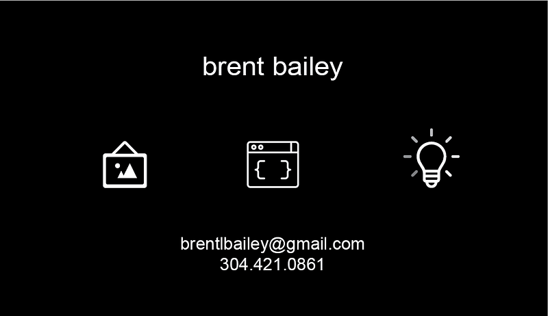
For the front, I went with Arial font (I’ve decided that’s the font I want to master, for now), and took icons from the noun project that I felt represent my skills: art, code, and thinking/consulting/ideation.

For an extra little touch, I had a color gradient on the white around the lightbulb to mimic the standard loading wheel.
There’s not too much to explain here, but I hope that this achieves the goal of (a) standing out and (b) communicating what exactly it is that I do.
Thanks for a great class!