Week 1: Design Analysis
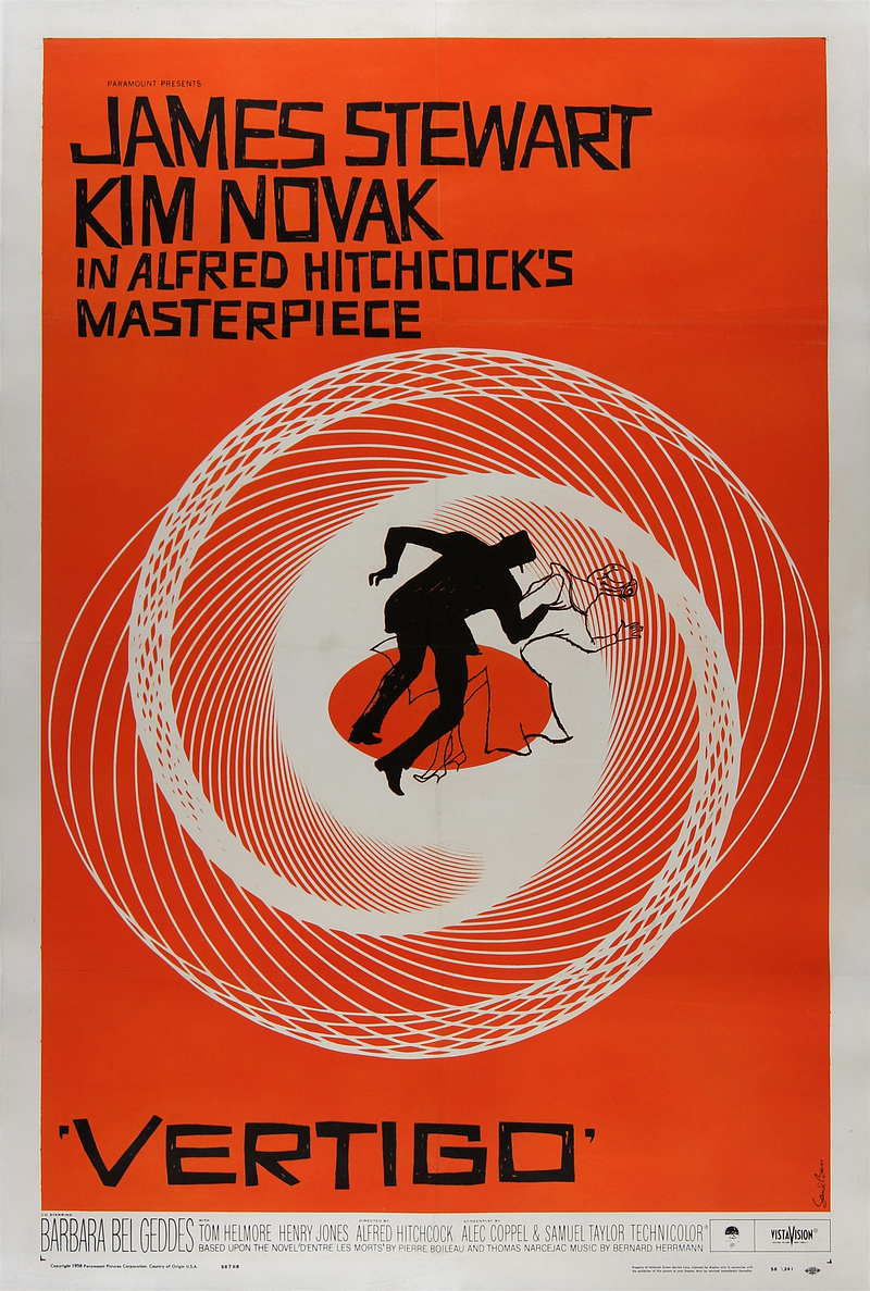
For my design analysis, I chose a classic poster for Alfred Hitchcock’s 1958 film Vertigo.

Its hierarchy is split into roughly three points of emphasis. First, the stars, emphasized by the larger font. This was a period in time when stars were one of your best guarantees of selling tickets, and James Stewart was one of the biggest. The designer clearly wanted this to draw the viewer’s attention.
Second, the illustration in the center, emphasized by the background spiral pattern (creating an atmosphere of vertigo around the two figures) opening into an oval in the center. The scene opens up a number of questions for the viewer: the man in black (an archetypal representation of evil), holding onto a woman in white (an archetypal representation of goodness and innocence). Is he pushing her, or holding onto her to prevent her from falling?
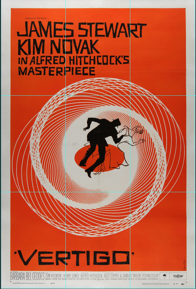
Third, the title of the film. Obviously you want people to know what the film is called. You can see this three-layered hierarchy when you apply a grid to the poster.
Each point of emphasis is surrounded by negative orange space, drawing the eye to its contents.

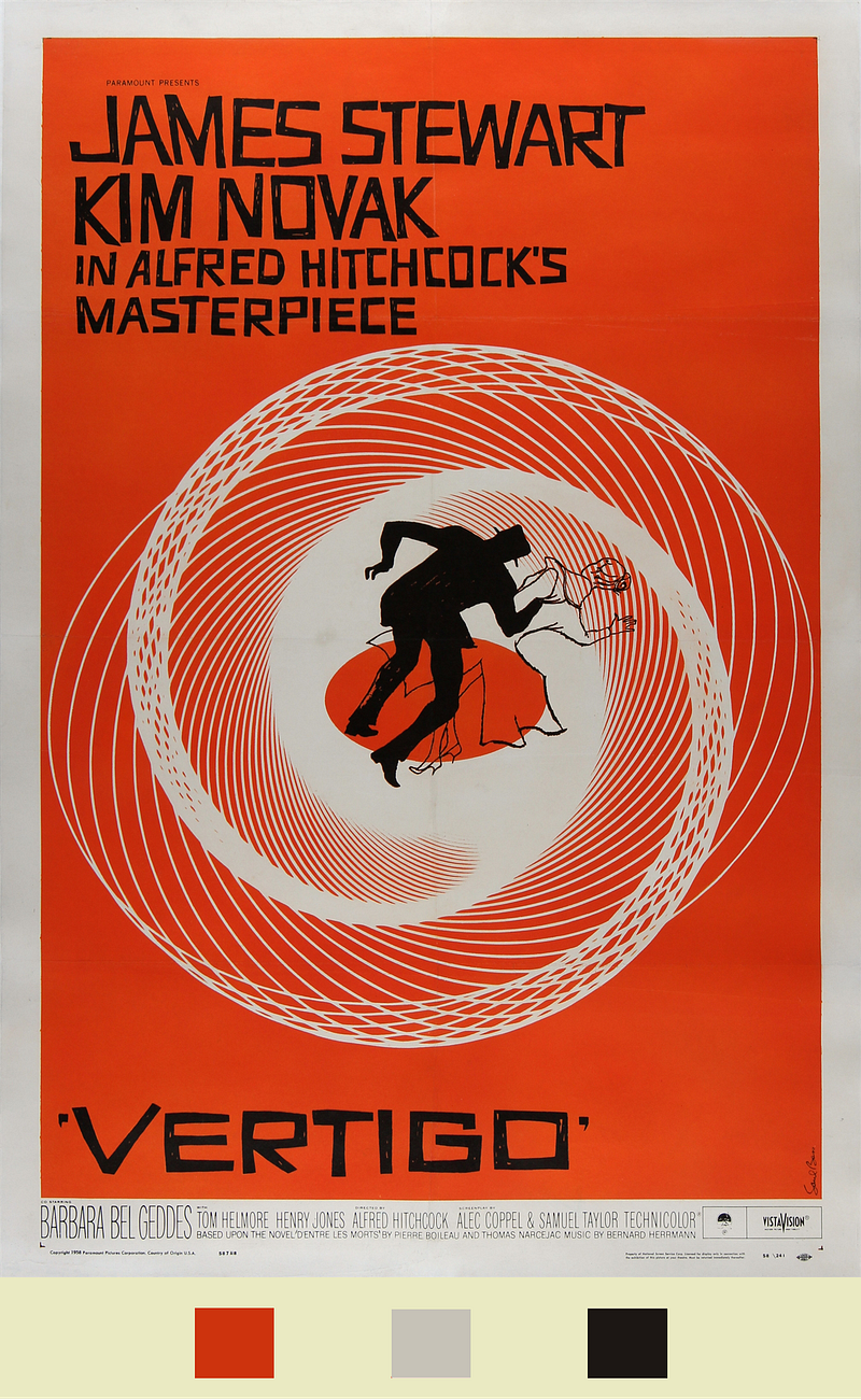
The color profile is similarly split into three — an off-white cream, orange, and black. Orange and black connote the frightening nature of the film — they’re the colors of halloween. The cream cuts and frames, and emphasizes the feminine figure as positive and innocent.

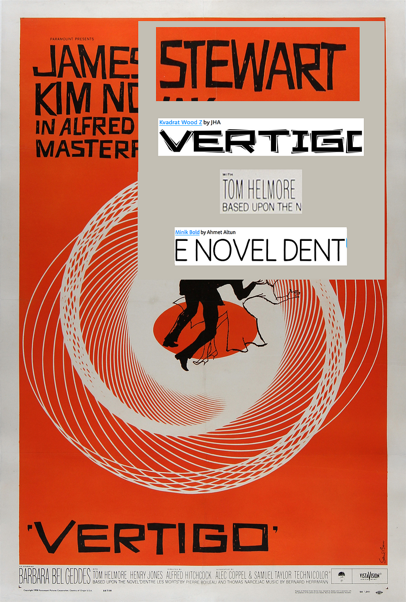
Since this poster is from 1958, it’s likely that the primary font was custom-lettered by the artist, and I was similarly unable to find the secondary fonts used for attribution, since this predates the computer. However, I’d like to draw attention to the primary font’s blocky, scratchy sans-serif aesthetic: especially combined with the color scheme, it gives the viewer the impression of roughness, harshness, and danger. Font size is used for different points of emphasis, as noted above — the leads and the title are larger, followed by “Alfred Hitchcock’s Masterpiece” — a secondary, but still important selling point. Smaller fonts are used to credit the studio and other contributors to the film.
The fonts pictured do appear to have inspired newer fonts, at least according to myfonts.com — I included them below.
