Week 2: Signage Research
For our second assignment, finding two signs that we felt were effective and two we felt were ineffective, I went on a walk through the East Village and, as predicted, didn’t have to go too far to find both good and bad examples.
The Bad
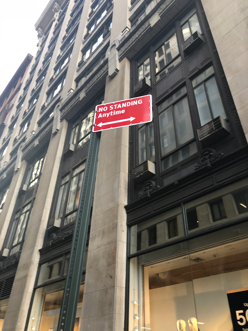
This first example has bothered me for a long time. No one ever refers to a car being stopped in a place as standing. It’s idling, or parked, or just “a car in a place”, but the connotation of standing, at least to me, is a human being standing in a place. While people standing in a “No Standing” area is certainly ill-advised as well, their target audience is cars. An American audience is, for the most part, inured to this loathsome sign, but the average English speaker from another country or ESL visitors would likely find this sign highly confusing.
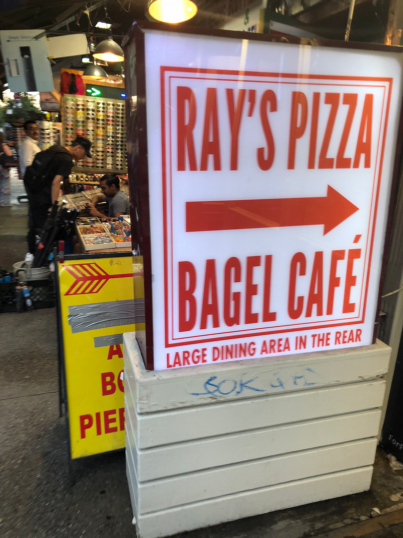
The second one, while I’m able to infer its meaning, doesn’t really pay much attention to the way people read. I see this sign, and I think the place sells pizza bagels. This one would easily be resolved by adding an ampersand, so I didn’t bother redesigning it.
The Good
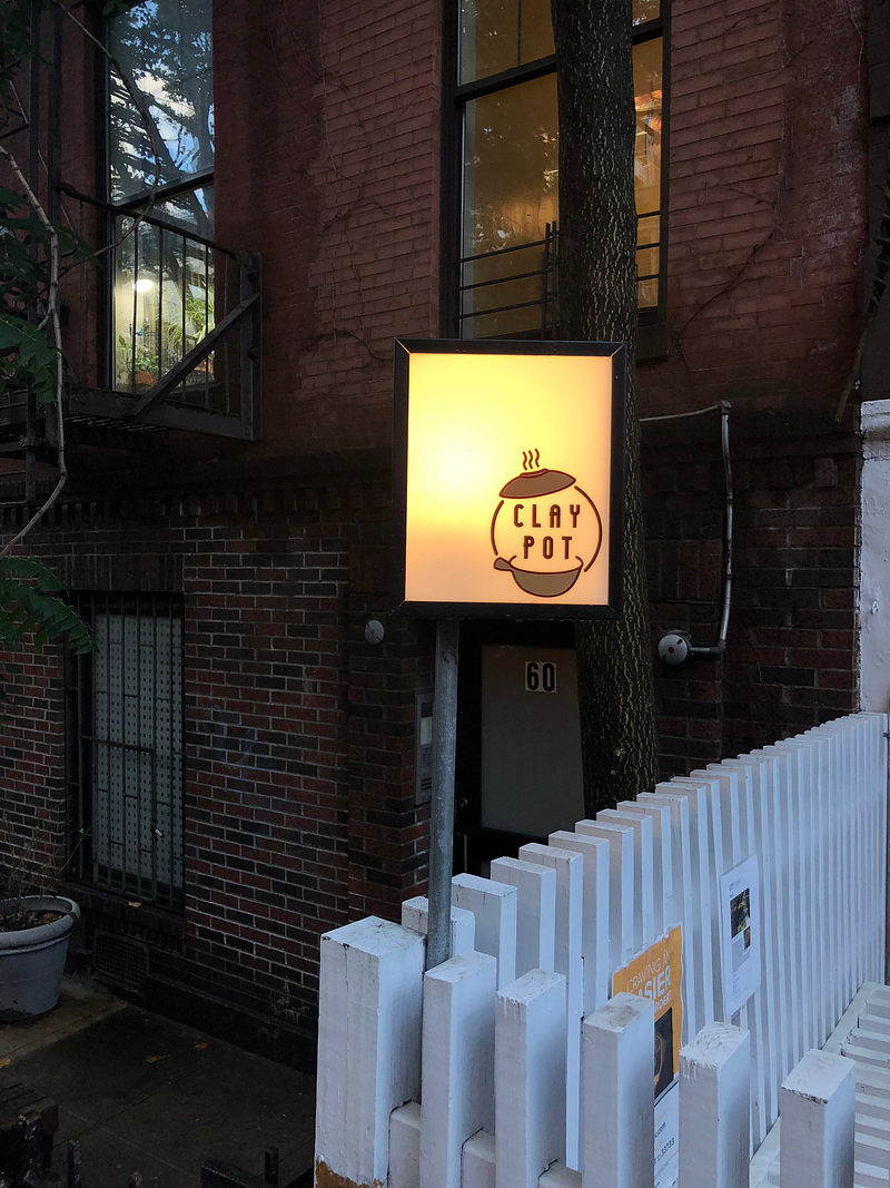
I just liked the aesthetic of this sign — most restaurant signs try to occupy all available space, while this one takes advantage of the whitespace to draw the eye to the logo, which is simple and reinforces the name: the restaurant is called the Clay Pot, and they use one font ensconced inside of a simple rendering of a Clay Pot.
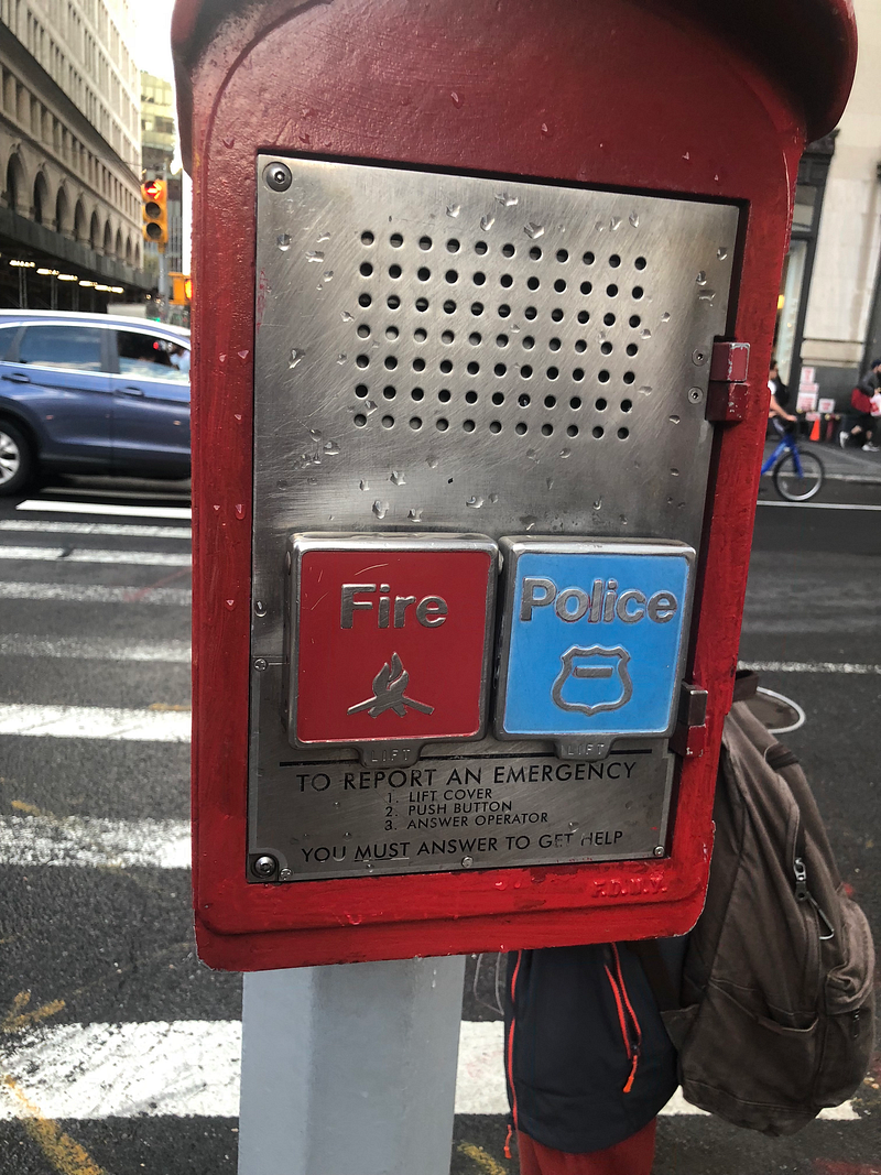
This is an older-fashioned design, but I feel it’s highly effective. Its use of universally understood symbols and colors for each button (blue and a badge for police, red and a flame for fire) to press make it easy to use even if you’re not an english speaker, and the secondary instructions are clear and easy to follow. The use of fonts is clever as well: there’s a clear hierarchy (Fire and Police, then guiding their eyes to the instructions, then reinforcing that they must answer at the end). It’s an oldie but a goodie.
Revamping The Sign
I had a pretty clear idea of what I wanted to do with the “No Standing” sign, so I didn’t bother with preliminary sketches and jumped straight into Photoshop. My goal was to replace ambiguous language with clear language, and add a visual component for non-English speakers. This is what I wound up with:
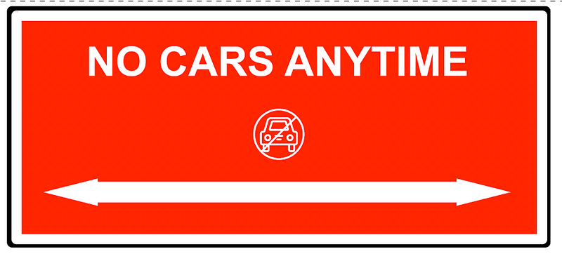
While I’ll admit it leaves something to be desired aesthetically, I think this communicates the message of the sign much more clearly. “NO CARS” certainly includes idling or “standing” and the icon reinforces that point.