Week 4: Personal Palette
For this week’s assignment, I went through my Instagram and selected colors that recurred regularly, or that I felt spoke to me. I ended up with this palette:

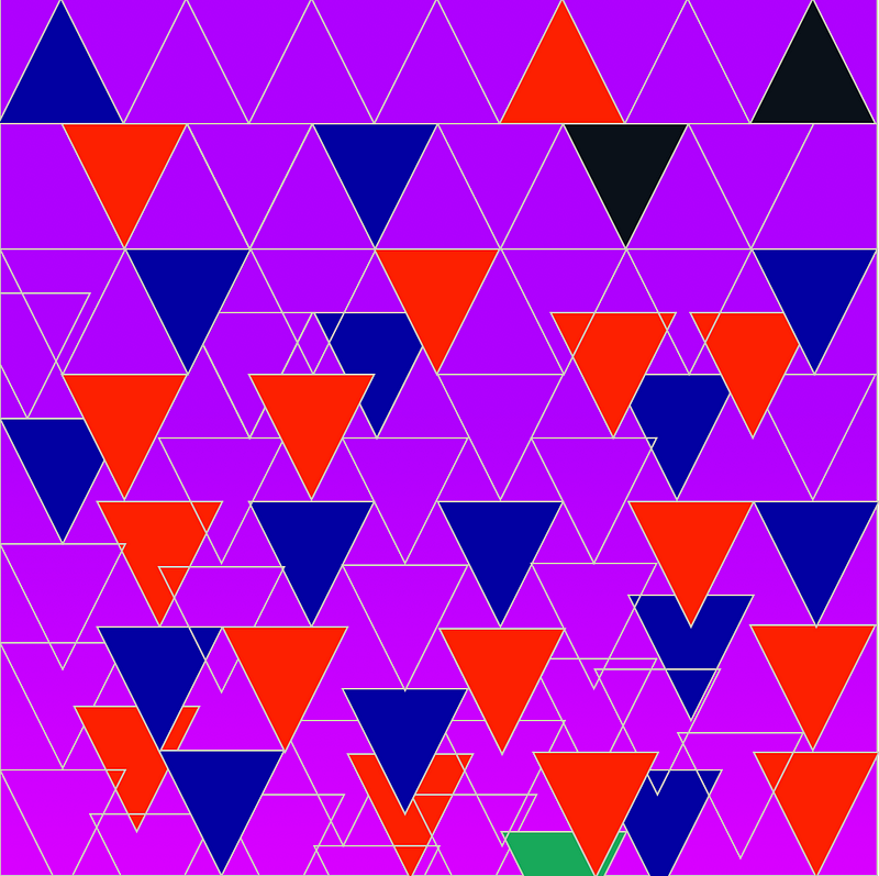
I initially started working with abstract shapes in Sketch, and quickly discovered that I had a problem: just randomly selecting colors I liked had resulted in a palette that I wasn’t a fan of: I felt that there was too wide a range of colors, and the green and the red in particular mixed poorly (I wasn’t going for a Christmas vibe). I tried to alleviate this by minimizing my use of colors that didn’t work together, as you can see in my first two sketches:
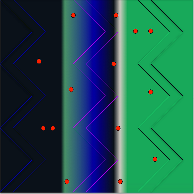
With both of these, I felt they represented a clash between order and chaos, which is a constant push-and-pull in both my life and my creative process. In general, I used black and red to represent chaos, green and blue to represent order, and purple for in between, using the tan/white for emphasis or breaks.
I realized I wasn’t too happy with my abstract shape work, so I decided to go ahead and try something that interested me in the last class: using 3-D effects in Illustrator. I ended up being much happier with the outcomes from this experiment:
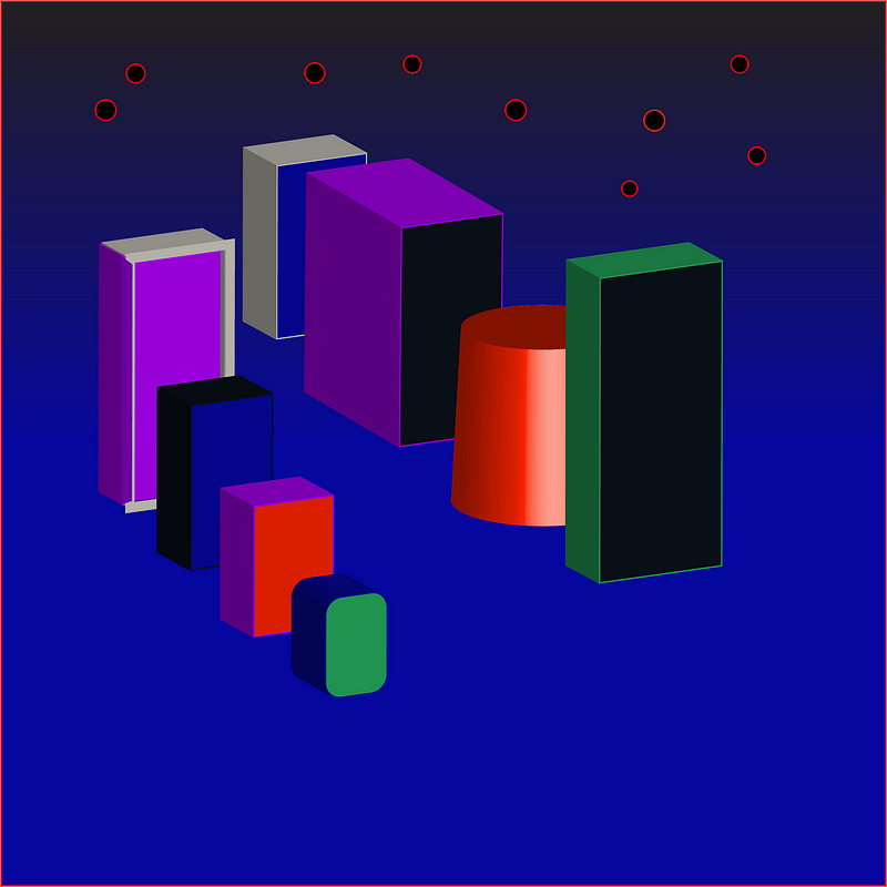
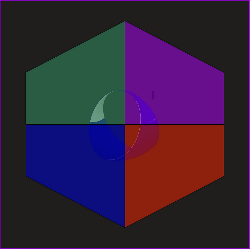
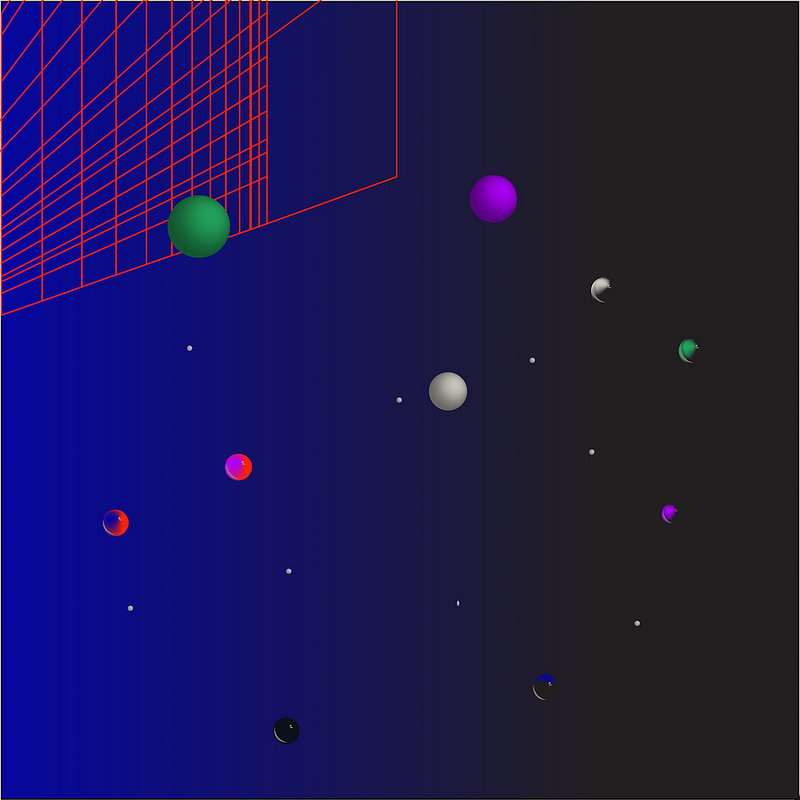
With the 3-D shapes, I had a few ideas about what I wanted to capture — an image that evoked the city, since I’ve lived in New York for 3 years and consider it to be a huge part of my identity, and one that evokes outer space (something that fascinates me, on a metaphorical level — as representative of void, entropy, and the aforementioned battle between order and chaos — and a physical one). Honestly, I’m not sure where the cube came from. I just liked it and rolled with it — consider that to be representative of whatever my unconscious is trying to express.
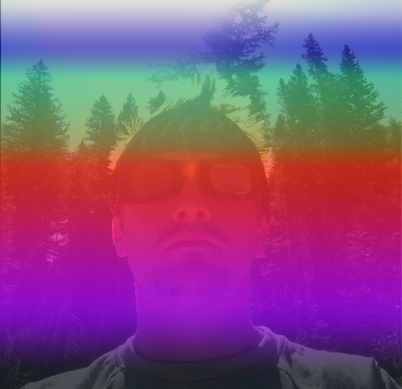
I got pretty into using gradients (and may have overdone it). For my final image, I decided to use a selfie from a trip I took to Wyoming for the total eclipse in summer 2017 and overlay a gradient of the full palette on it using Photoshop. This is one of my happiest memories, and one of my favorite pictures of myself, so it seemed like a good place to end.
Ultimately, this was a really fun project: my initial ideas about what to do with the palette I chose I think were misguided, but I managed to learn some new skills in three separate apps, and find some different approaches that better used the palette.